.png)
2. Do you know 35.7% of Black Friday Shoppers in 2021 were bots & fake accounts?* 37.9% of internet traffic is lost to bots, fake accounts, arbitrageurs, and other individuals that intend to profit from your brand. Besides causing stockout for real customers, since all the business decisions today are made based on data, contaminated data may make all the marketing efforts fail.
Making business decisions based on reliable data is critical for e-commerce businesses.
*Note: CHEQ polled over 42,000 websites in North America, Europe and Asia and performed hundreds of cybersecurity tests on each site visitor to determine their authenticity.Report Link
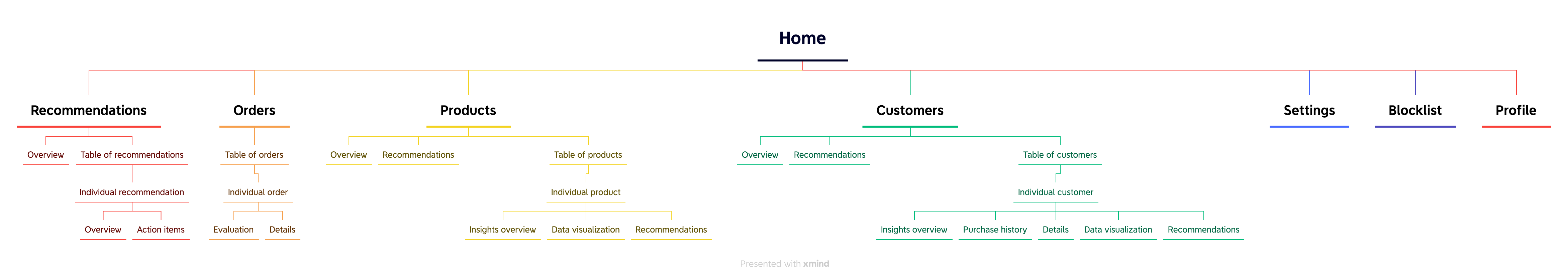
I redesigned and created 10 interfaces for a dashboard for e-shop owners and workers to easily access insights about orders, products, and customers with risk indicators, to make informed business decisions. The dashboard also includes recommendations and data visualizations to simplify data analysis for stand-alone shop owners. Here is the interface of home page providing quick updates on key metrics.

1. We successfully met our goal in growth. (data extracted within 90 days after the second launch, which is a subset of features shown here)
2. My user research insight inspired the founders to create the company's new slogan: Trust is a two-way street.
Daily Active Users
Shopify Users
Data intelligence is essential to the success of e-commerce businesses. BotNot is a startup who runs a platform that analyzes online purchases in real-time for e-shops. We enable trust of inbound data by ensuring all business decisions link back to the actual consumers.
Before I joined, BotNot didn’t launch their product. Their initial interfaces had lots of usability and visual issues. As the first and sole designer, I need to redesign all the screens and create a great user experience.
Create insightful and easy-to-use data dashboards to ease the pain of data analysis for e-shop owners and employees to make informed business decisions.
Growth in user base and daily active users. As we didn't launch the product officially before, user growth is our top business metric.
I choose heuristic evaluation to identify problems in their initial interface. After conducting heuristic evaluation based on Neilson’s 10 usability heuristics and accessibility, I found lots of problems in content, information architecture, user flow, and UI.


1) Inconsistent color usage and component design
2) Redundant and inconsistent information
3) Not accessible for colorblind people

Lack of customer overview, recommendation overview, and individual pages. Users cannot finish the actions in a full cycle.

The interfaces looked like an excel data dump, which is challenging for less data-savvy users to digest.
I chose user interviews as a way to gather user input, in order to avoid making decisions based on assumptions. Although the founders didn't support user research initially, I actively advocated for user research and conducted 3 interviews with e-shop team leaders recruited from my own network, which was later proved to be very insightful to the company.

To make data more actionable, we created recommendations and prominently placed them at the top of the sidebar for easy access. To keep the structure consistent, I followed a similar structure for each section. I put overview at the top to give users a glanceable view, and then user can go to the individual pages for details or action items.
I explored the tradeoffs of different layouts and different options for visualization.

I designed 10 main screens and dozens of components in total. Below are three example components or sections that I designed iteratively based on design principles which are synthesized from user research.
As a data dashboard website, it's crucial for us to ensure that our visualizations can adapt and keep pace with the growth of fast-growing e-commerce businesses, for the benefit of our users.
Taking this social network graph as an example, this graph aims to visualize the association of one account with other accounts. I started designing from scratch. The first version of social graph I designed would not be scalable if the number of bubbles increase. Therefore, I added segment controls and filters to only show information for highlighted ones.

Consistency is crucial as it can enhance users' trust in our system, which may translate to trust in the data we provide. Otherwise, people might think, "How can I trust data if you can't even keep a simple filter consistent?"
Initially, the components were not treated as a system and they were designed separately, which caused inconsistency issues. Later, I learned atomic design and design system, so I collected filters all together and created a unified design to reduce confusion.

Simplicity matters because the complexity of the user flow could add to the burden of processing information and various data flows for our users.
When I was designing a new export flow to other SAAS software, I tried different layouts: 1) pop-ups without preview; 2) a full-page overlay; 3) pop-ups with preview information; 4) sidebar overlay. Considering information density and layout consistency, I finally decided on a sidebar overlay design.

I conducted 5 tests with current and prospective clients. I chose user testing because it can help us validate our design concepts, find new problems, and evaluate users' satisfaction at a minimal cost before launching the product. Three main insights are:
Looking at lots of data all at once is tiring for users. I need to add color coding or any other means whenever possible to help them digest data.

I showed three UI options to users: the first one had colorful cards; the second one didn't have colorful cards; the third one was mono-color with gradients. All the users selected the second one. They wanted some colors to convey meanings but didn't want colors to be distracting.

Users primarily used the sidebar instead of the four main tabs on the table, complicating the user flow. One user stated they didn't notice the tabs during testing. To simplify operations, making segment controls more prominent may increase usage of this table.

New Feature 1
Pain point: Lack of meanings behind data
Solution: Make data actionable with recommended next steps
Users can easily take suggested actions to improve their business by reviewing recommendations and implementing them. To emphasize the value of this section, new recommendations are now the default tab on the homepage table, with action buttons highlighted and placed higher in the hierarchy to encourage use.


New Feature 2
Pain point: Lack of trust in data
Solution: Build data trust with impact visualization
During interviews, users mentioned they won’t trust the data and recommendations automatically. They will first try it out and see the impact. If it works, then they will trust it. Therefore, I designed a BotNot impact visualization to show them visually how much money BotNot save them.

New Feature 3
Problem: Lack of ways to implement insights
Solution: Design a new export flow to Klaviyo (a marketing email management tool)
I designed this export flow to make user flow a closed cycle so that users can implement the recommendations in other platforms.

New Feature 4
Pain Point: Too many numbers and information which is challenging to process for less data-savvy users
Solution: Make data digestible with visualizations, colors, and tags
I added various types of data visualizations on every page and marked raw data with visual aids, such as colors, to make data more digestable.


Design System

1. Currently, some information on individual pages didn’t get completely aggregated on overview pages. If I have time, I might explore more ways to aggregate information.
2. Continue improving design system by designing different states and nailing down more details with developers.
1. During early stages, product strategy can go back and forth pretty frequently, thus following atomic design principle and starting from the building smallest components can save you lots of time.
2. For companies who don’t naturally value user research, when I want to advocate for user research, I need to help them see the value, such as conducting trial interviews in my own network.
3. Working in a startup can be risky, but can also be rewarding and fun. I enjoy making more impact and seeing the impact in a short amount of time.


