.png)
Founded by professor Mike Tissenbaum at the University of Illinois at Urbana-Champaign, City Settlers is a competitive and collaborative city development game in a classroom setting. Working with teammates, students build their cities managing city metrics such as pollution, wealth, happiness, and population.
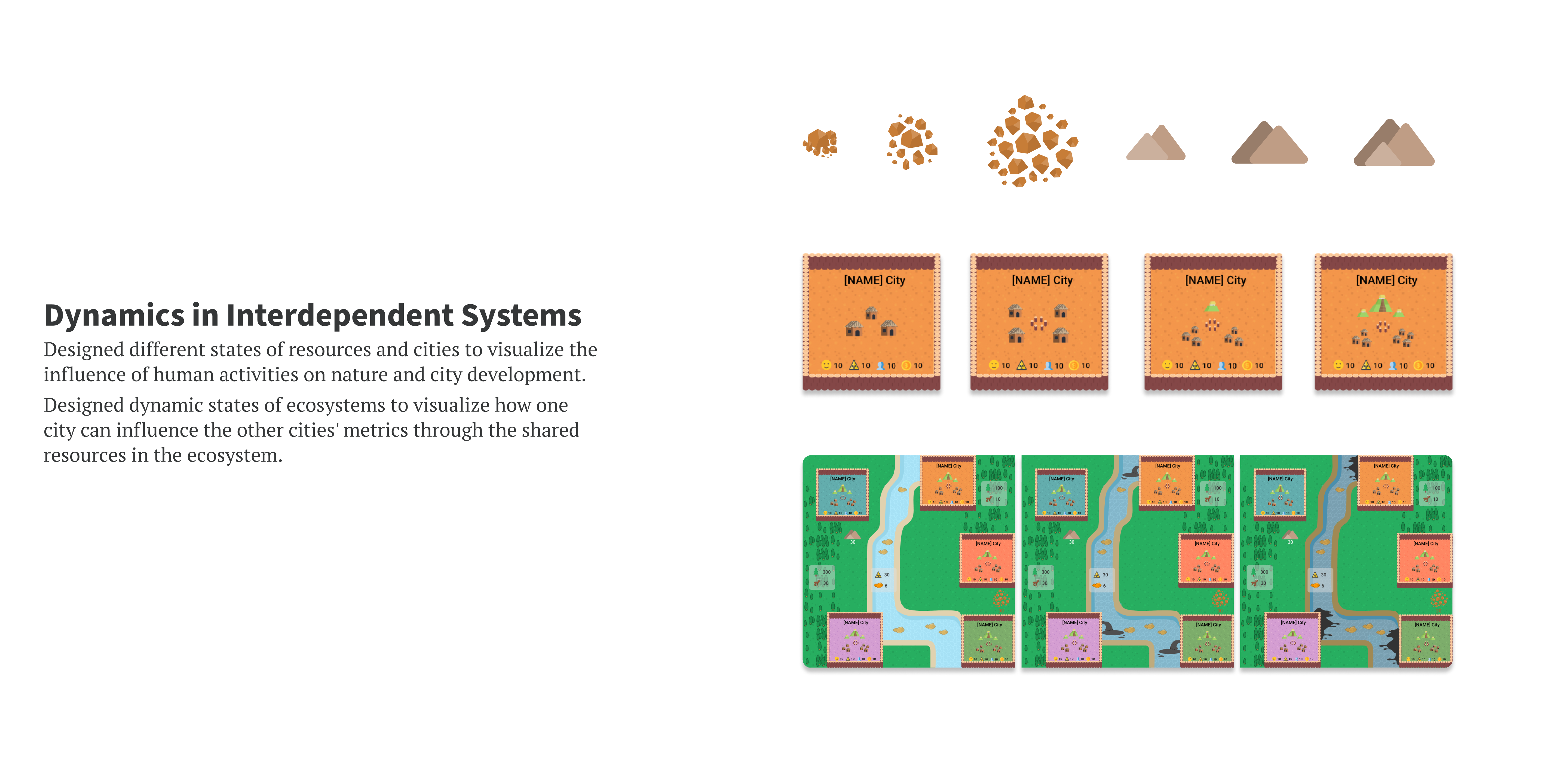
The goal of City Settlers is to help students from grade five to eight (10- to 14-year-olds) learn about interdependent ecosystems. The metrics of their own city are also influenced by the other cities' production and construction. Besides, the game can be customized to different historical civilizations to fulfill the instructional needs inSTEM and social science classes. I was hired to improve the usability and visual communication of this game.
.png)
This is a visualization of the classroom. 4 to 6 students team up and each team has three different interfaces.
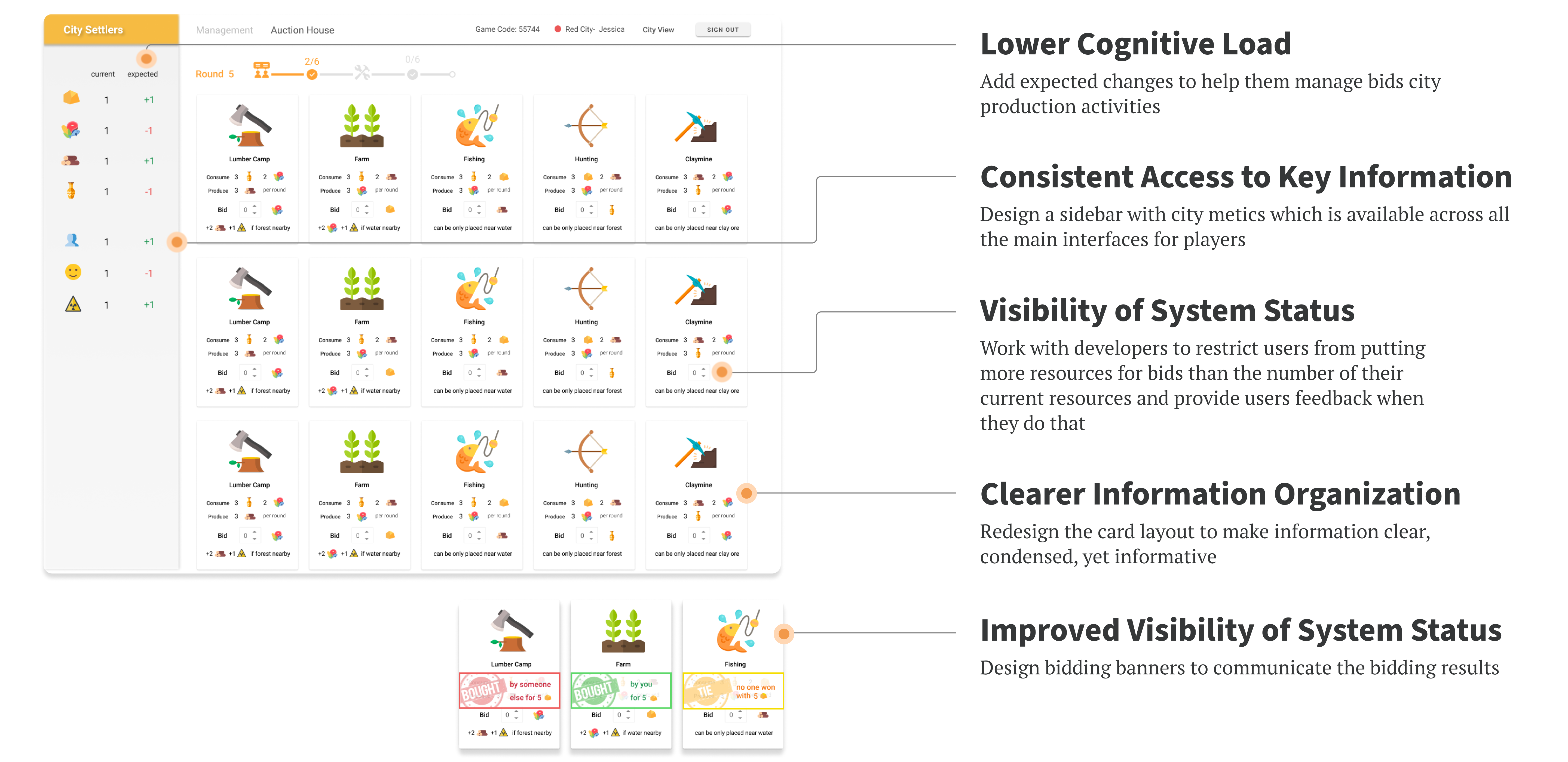
City view is for students to manage their city productions and facilities. On bidding view, students can bid for city facilities every round. Traders can walk around the classroom and trade resources with other teams on the trader view.
Public view is like a "world map" where students can see the overview of different cities and natural resources on the classroom's big screen. Teachers use teacher view to manually control the gaming process.
As you can see from the right, the initial interfaces had bad visuals and usability problems.
My goals:
1. Find design opportunities from playthroughs
2. Improve usability and visual communication
3. Collaborate with developers for implementation

At the start of my project, I led an observation session in a real primary school classroom to observe how students reacted to the interfaces. Here are some highlights of pain points for each interface.
.png)


.png)
Four elements, which compose the word "CITY", represent a balance/tension between human production (represented by chimney and hammer) and ecosystems (represented by animals and plants). This composition also reflects how humans develop their civilizations relying on natural resources.
I also tried to use a Cahokia mount as the logo, but since the long term goal of our game is to be customizable for different historical periods, our game will not be limited to the Cahokia period in the future, thus we preferred to adopt the final logo to represent the essence of the game.

.gif)

After exploring different gradient backgrounds, I finally decided on this one because this gradient symbolizes the color of nature-- from pinkish-orange sunset to green trees, besides the green and pink combination contrast with the logo pretty well
Designed buildings of different historical periods to show this game's customizability to fit instructional needs in different historical contexts.

Besides improvements in design crafts, I also realized that design is not just for problem-solving or aesthetics, but can be also for educational purposes.
A successful educational designer should be able to understand who are the players, what they need, and how to educate them on top of their current level. Taking the participants’ age and knowledge level into account, I made iconography design decisions considering objects with which children might associate the graphics, and incorporated children’s cartoon style preferences and playfulness into the aesthetics of the game’s websites and interfaces. To bridge the knowledge gap between instructors and learners, I crafted gamified visualizations to deliver theoretical concepts in a more intuitive and playful way, such as designing a graphical map to visualize the concept of interdependent ecosystems-- the consequences to the ecosystems and neighbor cities caused by cities’ activities.
Unfortunately, Covid-19 delayed our plan of conducting another round of player testing with my revised interfaces with kids in classrooms. If I have the chance, I would love to conduct some usability tests and evaluate the improvements brought by my designs.


