Structure Planning
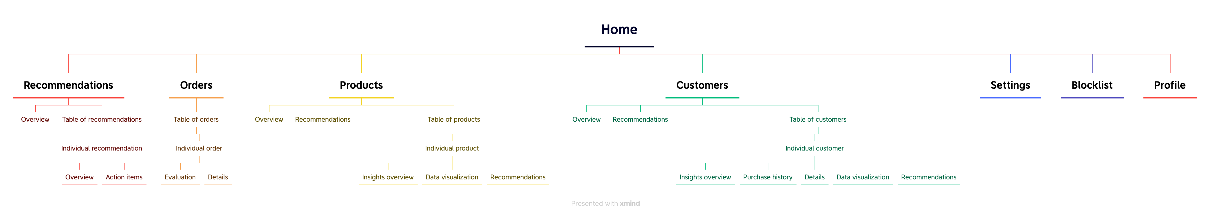
Information Architecture
To make data more actionable, we created recommendations and prominently placed them at the top of the sidebar for easy access. To keep the structure consistent, I followed a similar structure for each section. I put overview at the top to give users a glanceable view, and then user can go to the individual pages for details or action items.
Layout Sketches
I explored the tradeoffs of different layouts and different options for visualization.

Iterate Based on Design Principles
I designed 10 main screens and dozens of components in total. Below are three example components or sections that I designed iteratively based on design principles which are synthesized from user research.
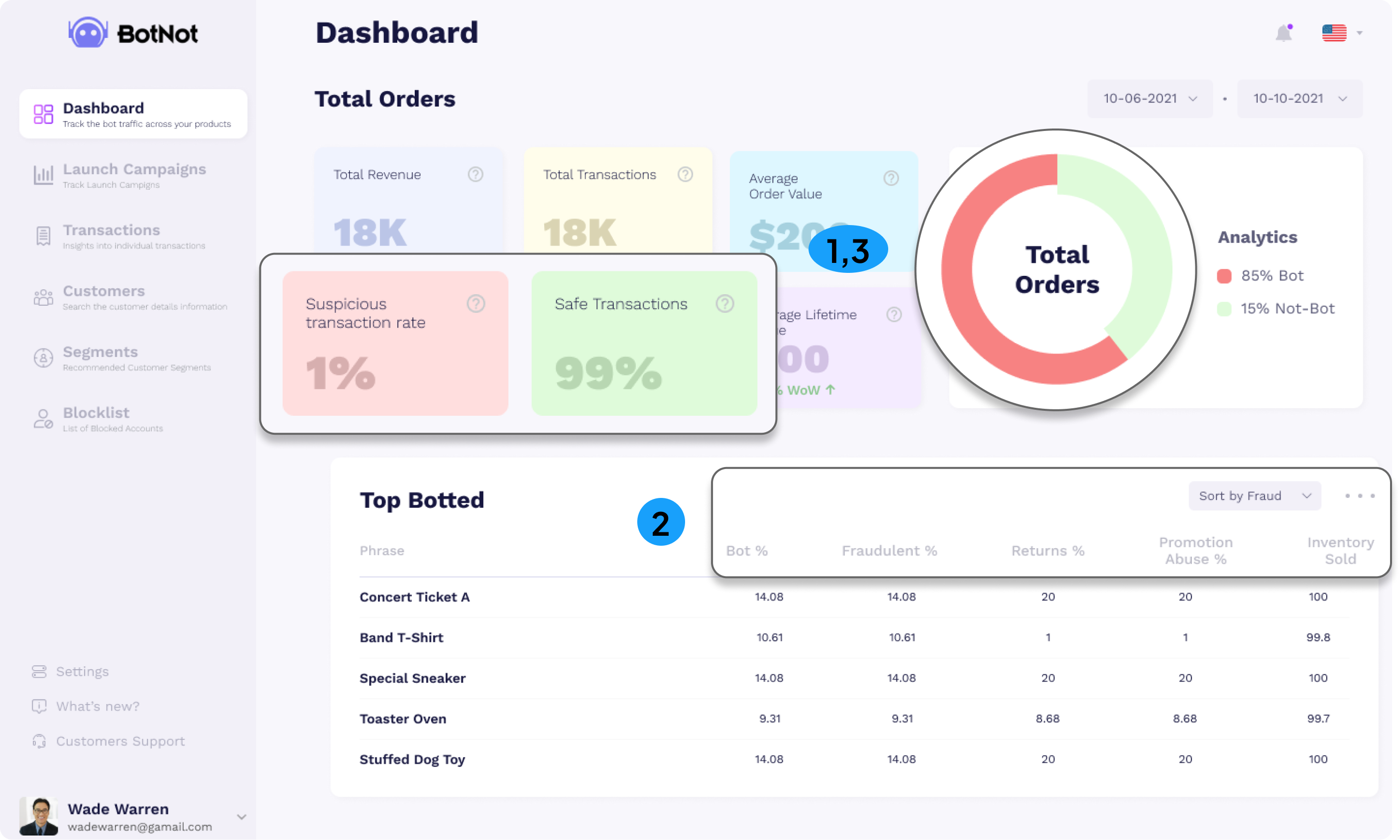
1. Scalability
As a data dashboard website, it's crucial for us to ensure that our visualizations can adapt and keep pace with the growth of fast-growing e-commerce businesses, for the benefit of our users.
Taking this social network graph as an example, this graph aims to visualize the association of one account with other accounts. I started designing from scratch. The first version of social graph I designed would not be scalable if the number of bubbles increase. Therefore, I added segment controls and filters to only show information for highlighted ones.

2. Consistency
Consistency is crucial as it can enhance users' trust in our system, which may translate to trust in the data we provide. Otherwise, people might think, "How can I trust data if you can't even keep a simple filter consistent?"
Initially, the components were not treated as a system and they were designed separately, which caused inconsistency issues. Later, I learned atomic design and design system, so I collected filters all together and created a unified design to reduce confusion.

3. Simplicity
Simplicity matters because the complexity of the user flow could add to the burden of processing information and various data flows for our users.
When I was designing a new export flow to other SAAS software, I tried different layouts: 1) pop-ups without preview; 2) a full-page overlay; 3) pop-ups with preview information; 4) sidebar overlay. Considering information density and layout consistency, I finally decided on a sidebar overlay design.

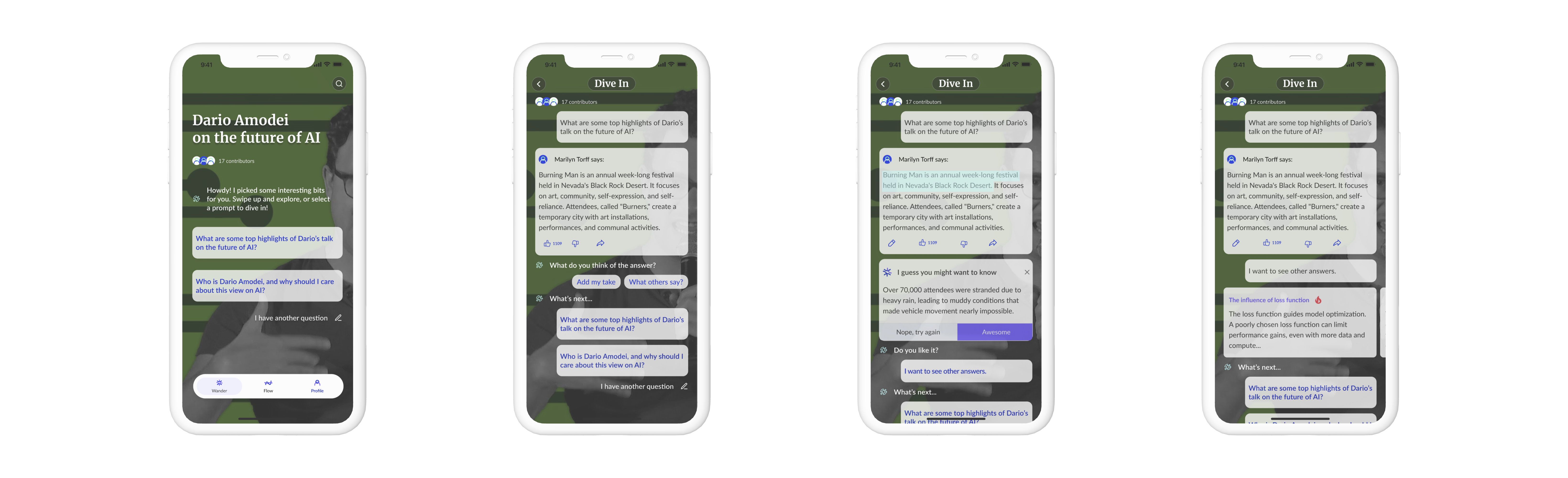
Iterate Based on User Feedback
I conducted 5 tests with current and prospective clients. I chose user testing because it can help us validate our design concepts, find new problems, and evaluate users' satisfaction at a minimal cost before launching the product. Three main insights are:
.png)